My GIS Coursework at Northeastern Illinois included projects in urban systems, natural systems, remote sensing, and spatial statistics.
Pandemic Train Ridership in Chicago
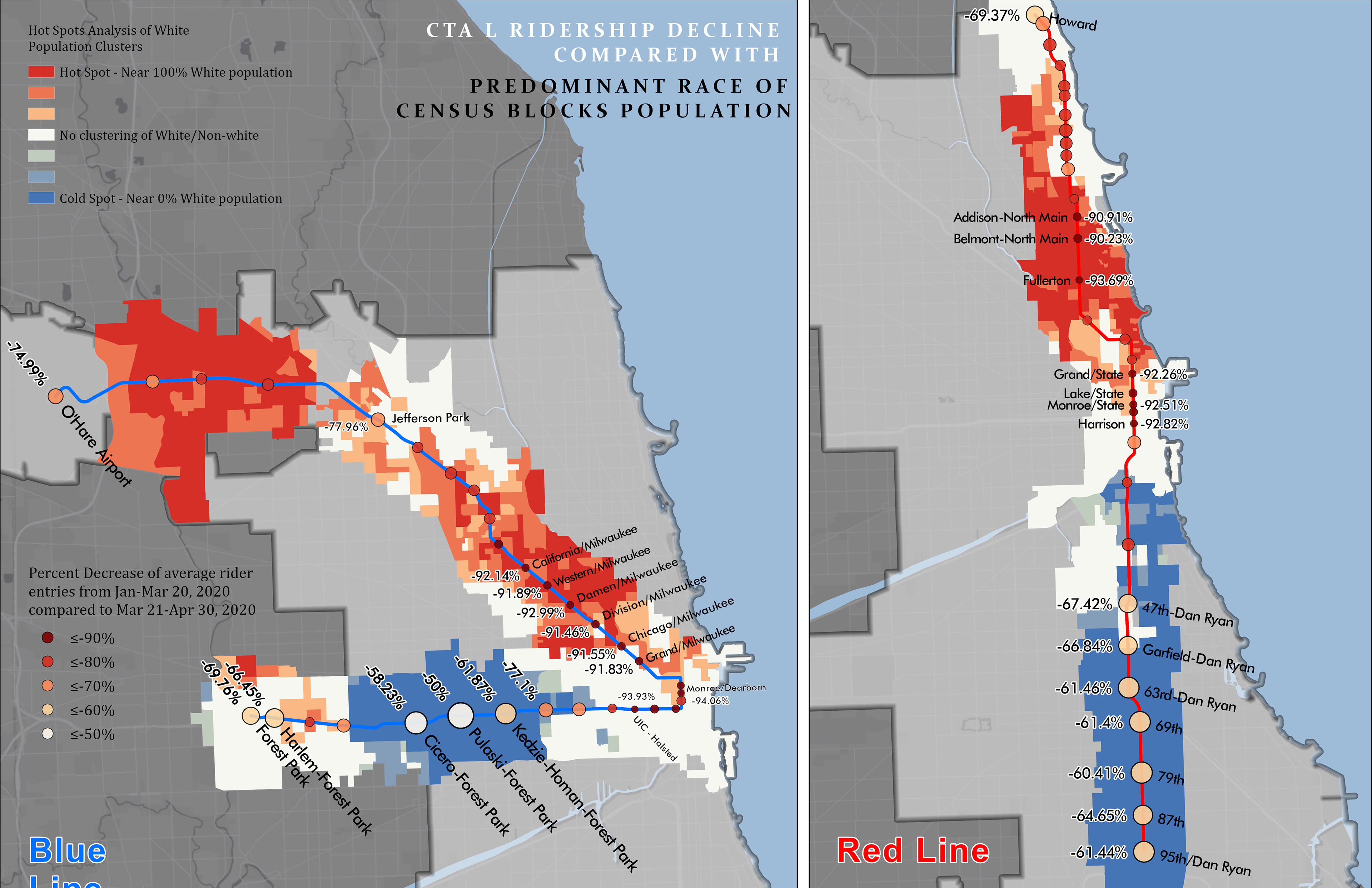
As a continuation of the time animation I made (see Cartography section), I created a demographic analysis of L ridership decline and the surrounding Census blocks. I used the CTA's daily El station entry data to find the percent decline of riders at each El station in the first quarter of 2020 and noticed that the ridership at some stations did not decline as much as at others.
I then extracted the census blocks within a half mile of each station and ran a Hot Spot analysis with ArcPro to show clustering of race by census block to see what correlation there might be between race and ridership loss.
The results showed that the many of the stations with the highest ridership decline were located in areas of the city with high clustering of white populations. In contrast, almost all of the stations with the least ridership decline were located in areas of high non-white populations.
_____________________________________________________________________________________________
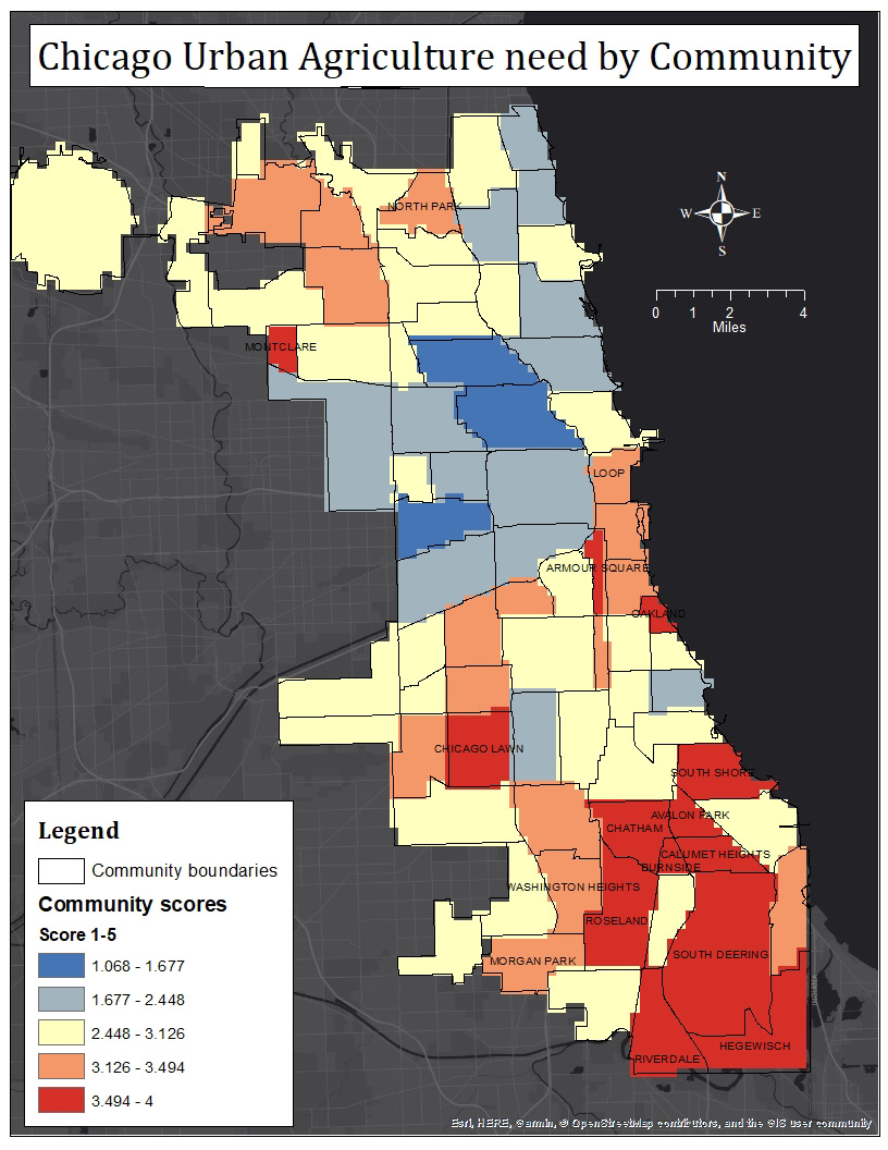
Chicago Urban Agriculture Needs Assessment
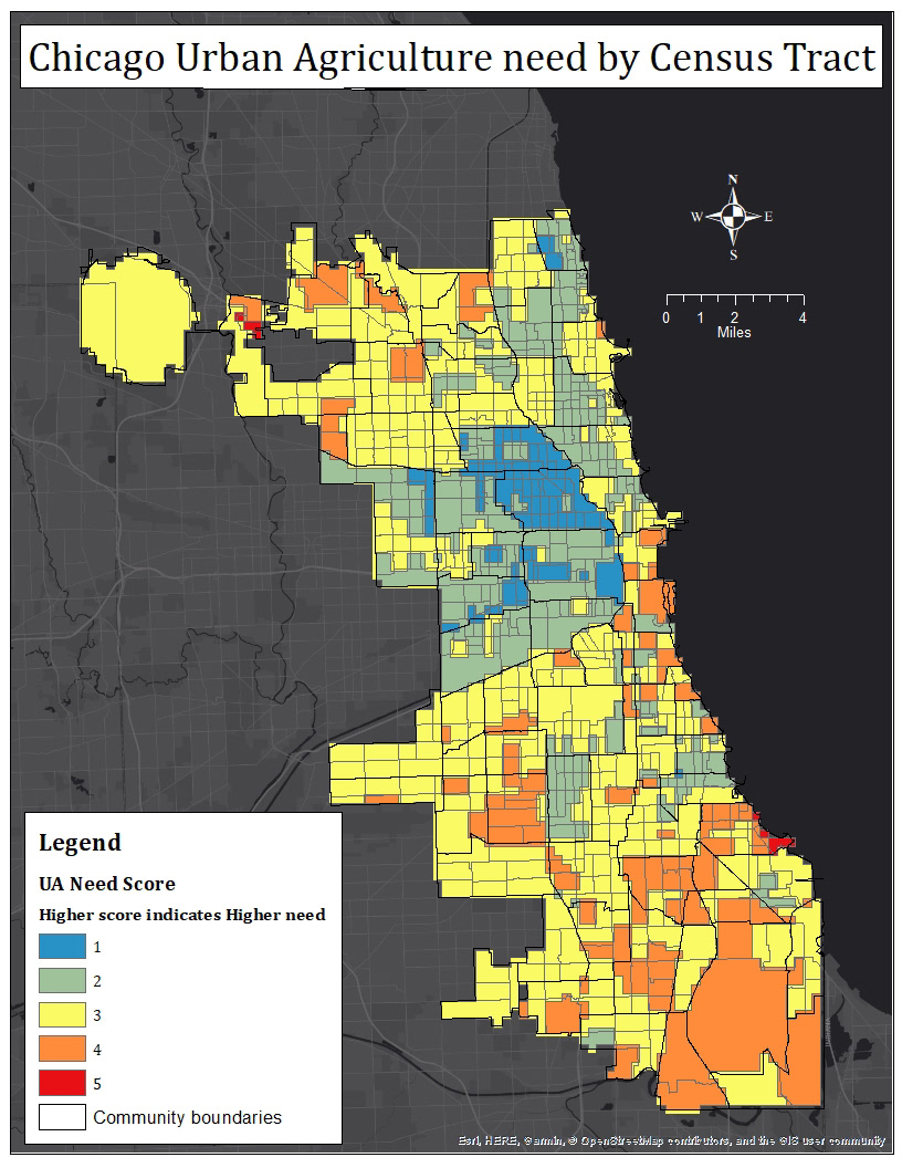
This map was the end product of an analysis I did of urban agriculture need in Chicago. This map showed which census tracts were well-served or under-served by existing urban agriculture.
The analysis looked at Chicago census blocks with high levels of poverty, low access to grocery stores, and the location of existing urban agriculture infrastructure. I ran kernel density analysis on the grocery stores and urban agriculture locations and changed the census block data to raster format in order to be able to combine the three variables for the analysis.
I combined these three rasters in a needs analysis and then aggregated the results up to census tracts. Finally, I took the rasters from the census tracts and converted the data back vector by aggregating and averaging the census blocks into the Chicago Community Areas.
_____________________________________________________________________________________________
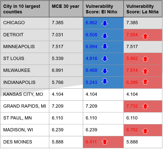
El Niño/La Niña Snowfall Analysis
This project was interesting because I combined interpolated snowfall data in raster format with county-level vector data. For this project, I used Zonal Statistics by Table to aggregate the raster data and attach it to the county polygons.
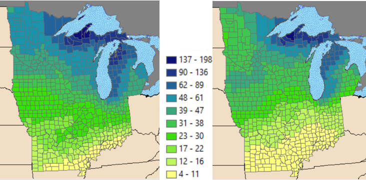
I then ran a Multi-Criteria Evaluation combining the county hazards with the average snowfall by county.
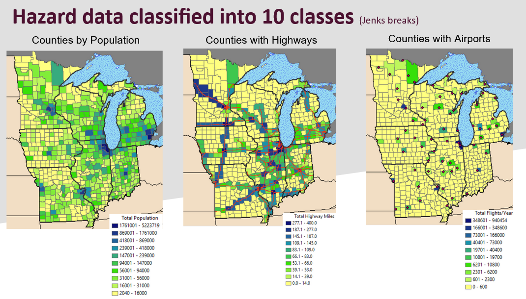
In the final analysis, these two came together to show which countieshad an increased or decreased risk from snowfall variance in El Niño and La Niña winters compared to an "average" winter.
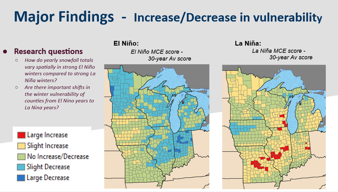
I also calculated the snowfall vulnerability for the ten largest counties by population to see which ones showed the greatest increase or decrease between El Niño and La Niña winters.
_____________________________________________________________________________________________