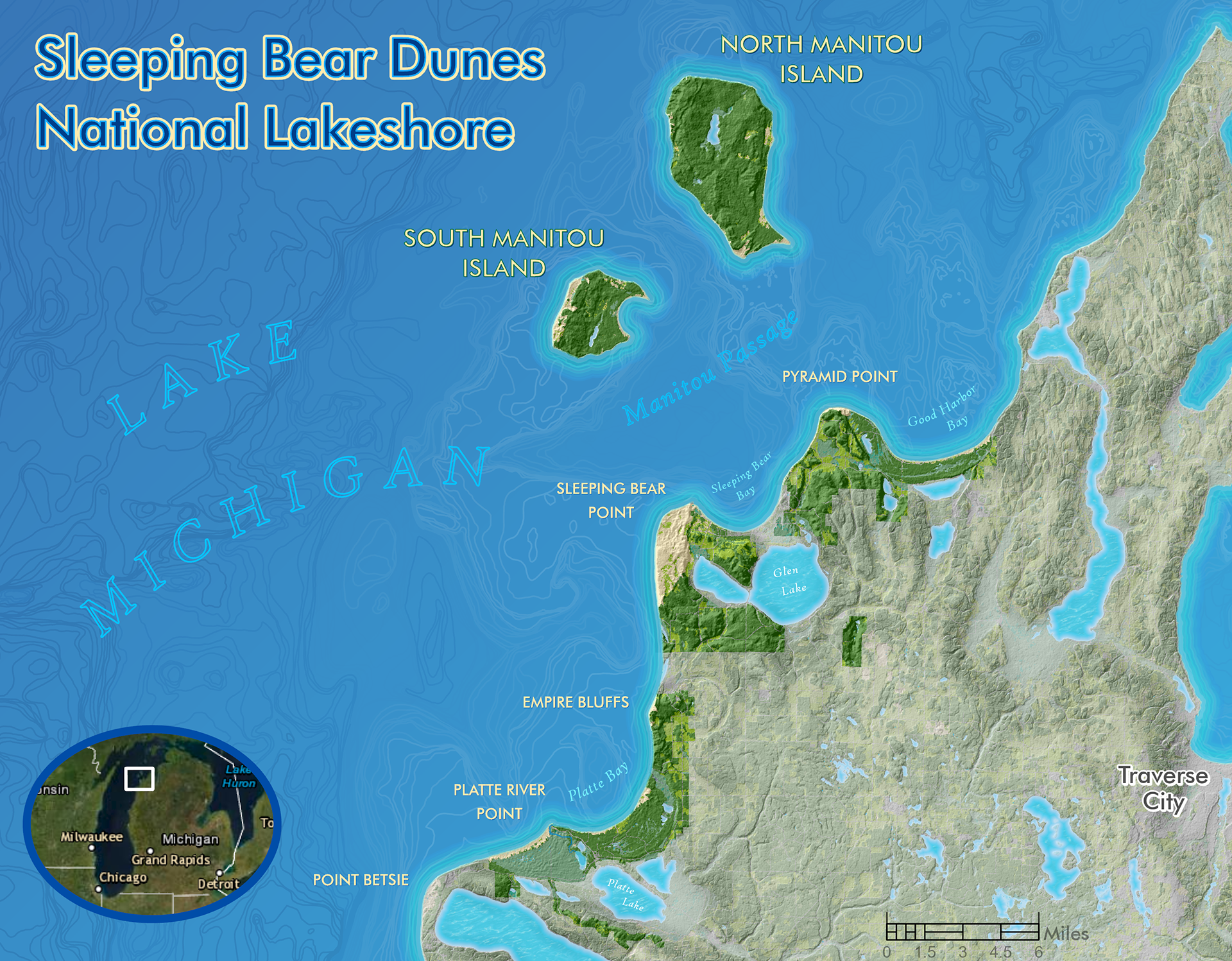
Cartography with ArcGIS Pro
After taking a cartography MOOC from ESRI in the summer, I put this map together using a number of techniques in ArcGIS Pro, such as layer transparency stacking, coastline strokes, and labeling, which I learned from the class and from reading blogs (the blogs by John Nelson and Kenneth Field in particular were super helpful for ideas).
I was trying to capture the beautiful shades of blue that are seen in Lake Michigan in this area, as well as the dune topography, which as anyone who has hiked there will tell you is no stroll in the park!
_____________________________________________________________________________________________
Cartography with ArcMap and Adobe Illustrator
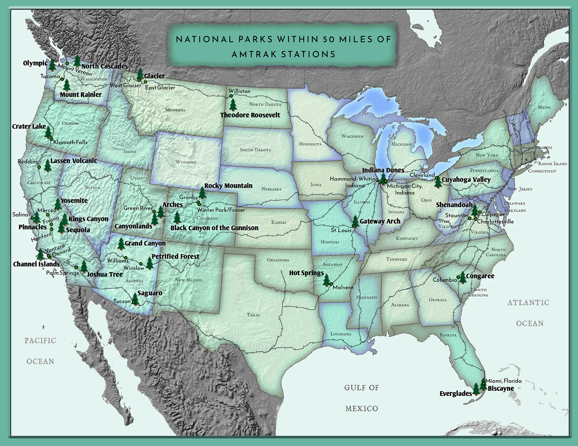
I am a fan of train travel as well as visiting national and state parks, so this map combines the two together and allowed me to practice combining workflows in both ArcMap and Adobe Illustrator. I had previously visted Glacier, Yosemite, and Indiana Dunes National Parks by train and bus, and my goal for this map was to show the national parks within 50 miles of an Amtrak station.
I was fortunate to take a computer cartography class earlier that year taught by Daniel Huffman, a very active member in the cartography world. His blog Something About Maps has become one of my go-to's whenever I am looking for inspiration or new techniques to learn.
The process for this map included data gathering and editing in ArcMap before exporting everything for styling and coloring in Illustrator.
_____________________________________________________________________________________________
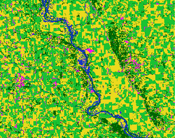
Cartography with ArcMap and Adobe Illustrator
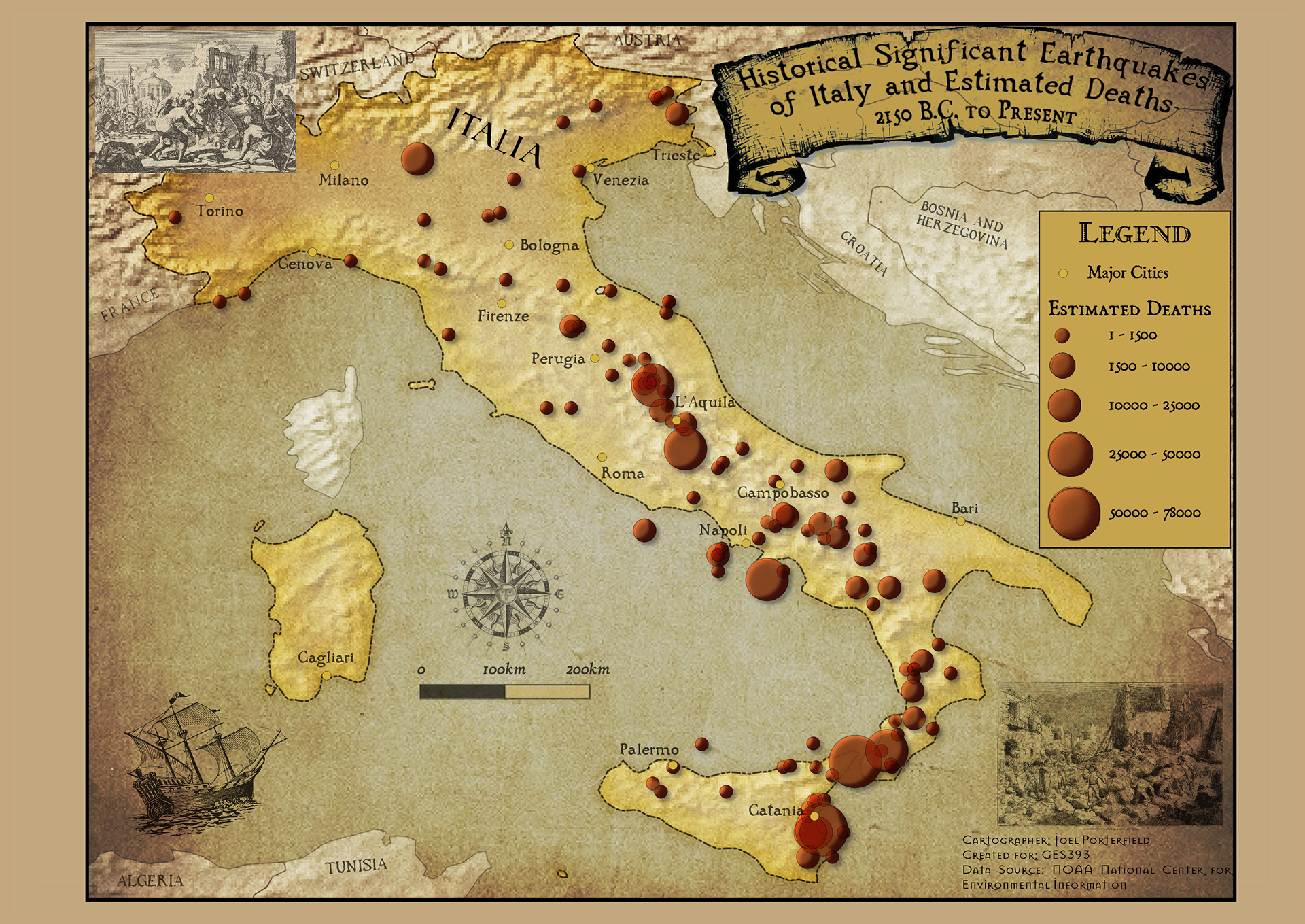
In one of my GIS classes we learned QGIS, a free and open source software program used for data processing and mapping. This was the first map that was focused particularly on the image asthetics as opposed to the data analysis. QGIS offers some layering, symbol, and text options that ArcMap does not, although many of those options are now available with Pro.
My goal for this map was to make a historical-looking map and searched for the historical images as well as the old-looking texts. The QGIS techniques used were symbol transparencies, image layering, and text modification.
_____________________________________________________________________________________________
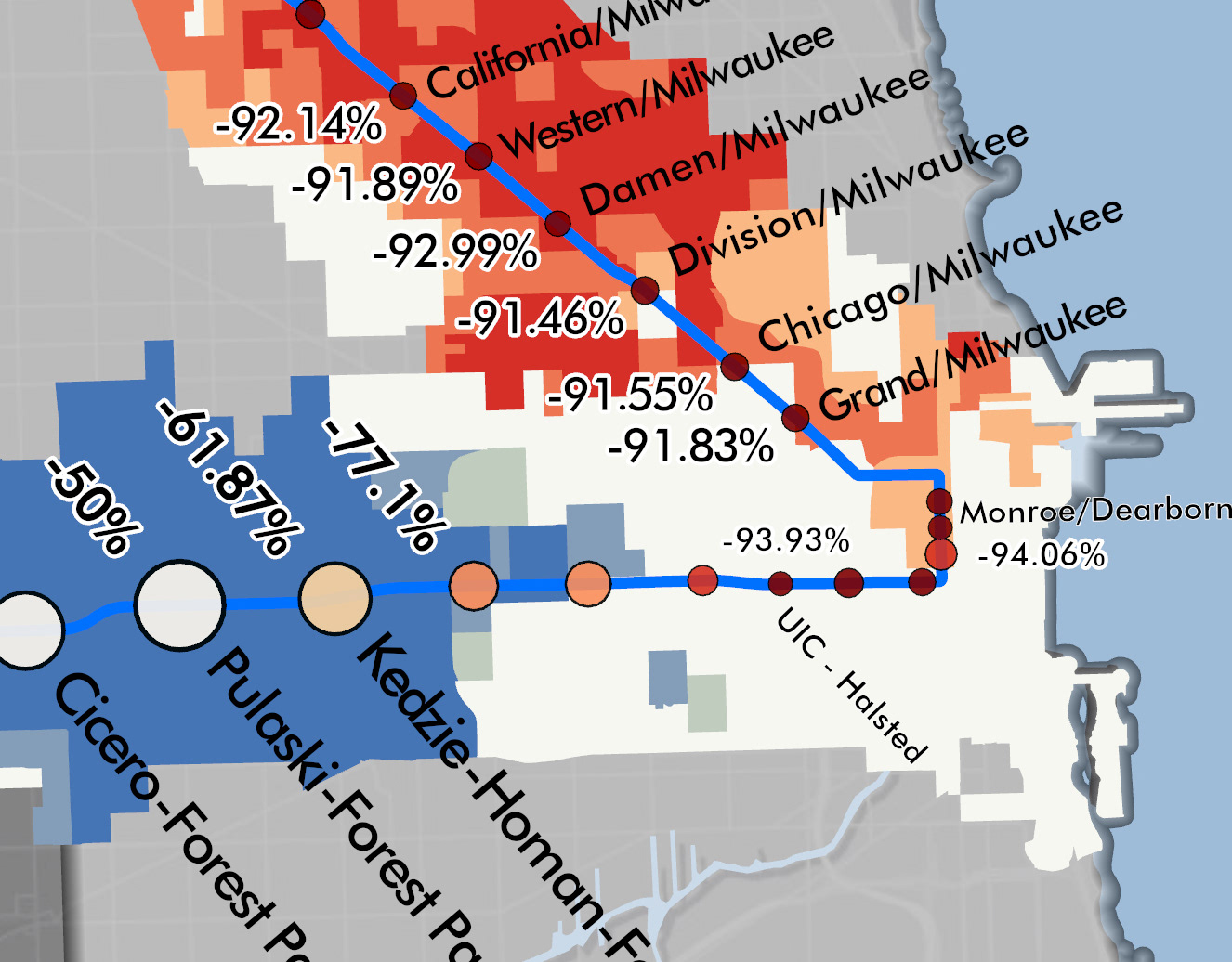
Time Animation in ArcGIS Pro
In the early summer of 2020 I saw a map on Linkedin showing the ridership decline at different CTA train stations in Chicago during the early days of the pandemic shutdown. It was interesting to see see which stations had lost almost all of their daily ridership and which had only lost a fraction.
Inspired by this map, I decided to take it a step further and show the ridership decline in a different way. This time animation shows the daily rider entries at each L station for the first four months of 2020. The data for the map was taken from the Chicago Data Portal and put together using ArcGIS Pro.
_____________________________________________________________________________________________
Time Animation in ArcGIS Pro
Another project that I did to practice different techniques I learned in the ESRI MOOC I took, this animation shows the tracks and category levels of all the Atlantic tropical storms and hurricanes from the highly active 2004 season. Some of the techniques used include a customized basemap, firefly symbols, symbolizing by attribute, labeling, and time animation with a dynamic text.
_____________________________________________________________________________________________